How to Decorate with Prints Without Fear
Discover how to decorate with prints without fear and give personality to your home. Key tips to combine patterns with harmony and style, get inspired by my exclusive designs!
Prints have the power to transform any space, bringing personality and dynamism to the decoration. However, sometimes they can raise doubts about how to combine them without overloading the environment. As a print designer, I love to play with patterns to create balanced environments full of character. In this article, I will share with you some tips to decorate your home with prints without fear.
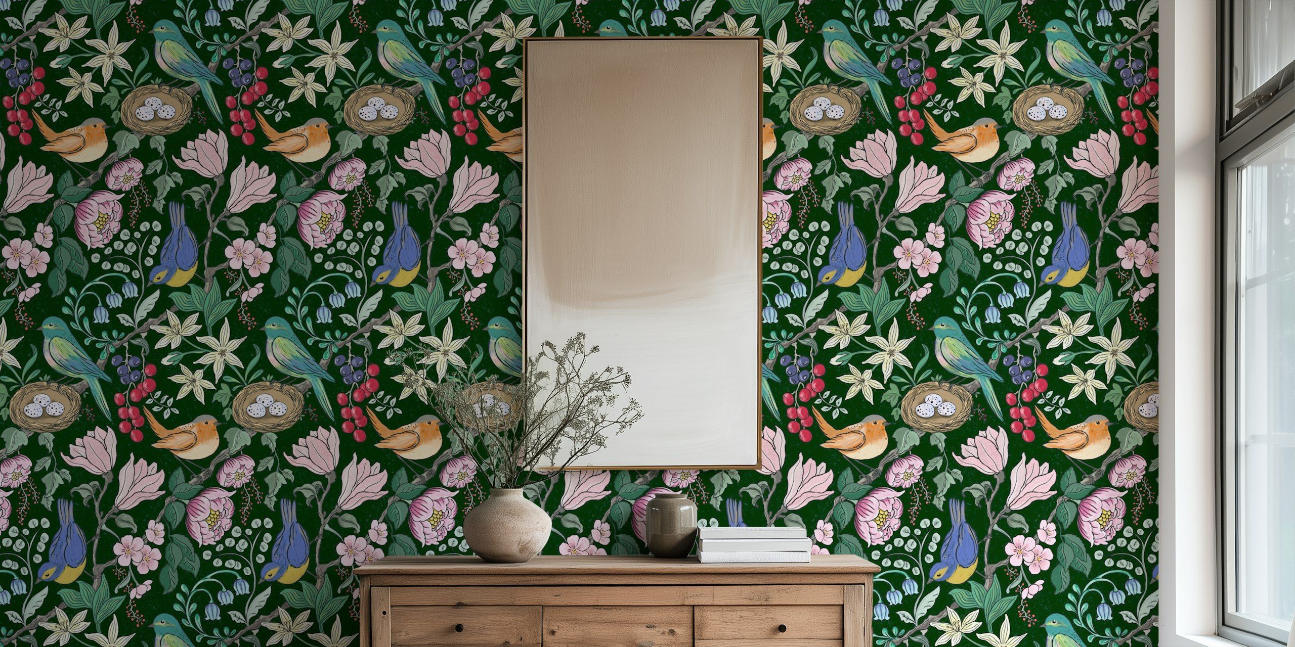
If you are not used to using prints in decorating, it is best to start with a protagonist element. It can be a wall with wallpaper, such as my design Flourishing Vines inspired by the Arts & Crafts movement, or an eye-catching rug. Once you have this focal point, you can build the rest of the decor around it.

A sure-fire trick to keep prints from competing with each other is to choose a common color palette. For example, my designs like Calming Stripe Symphony o Small Sage Loop have soft tones that integrate perfectly in minimalist or Nordic spaces.


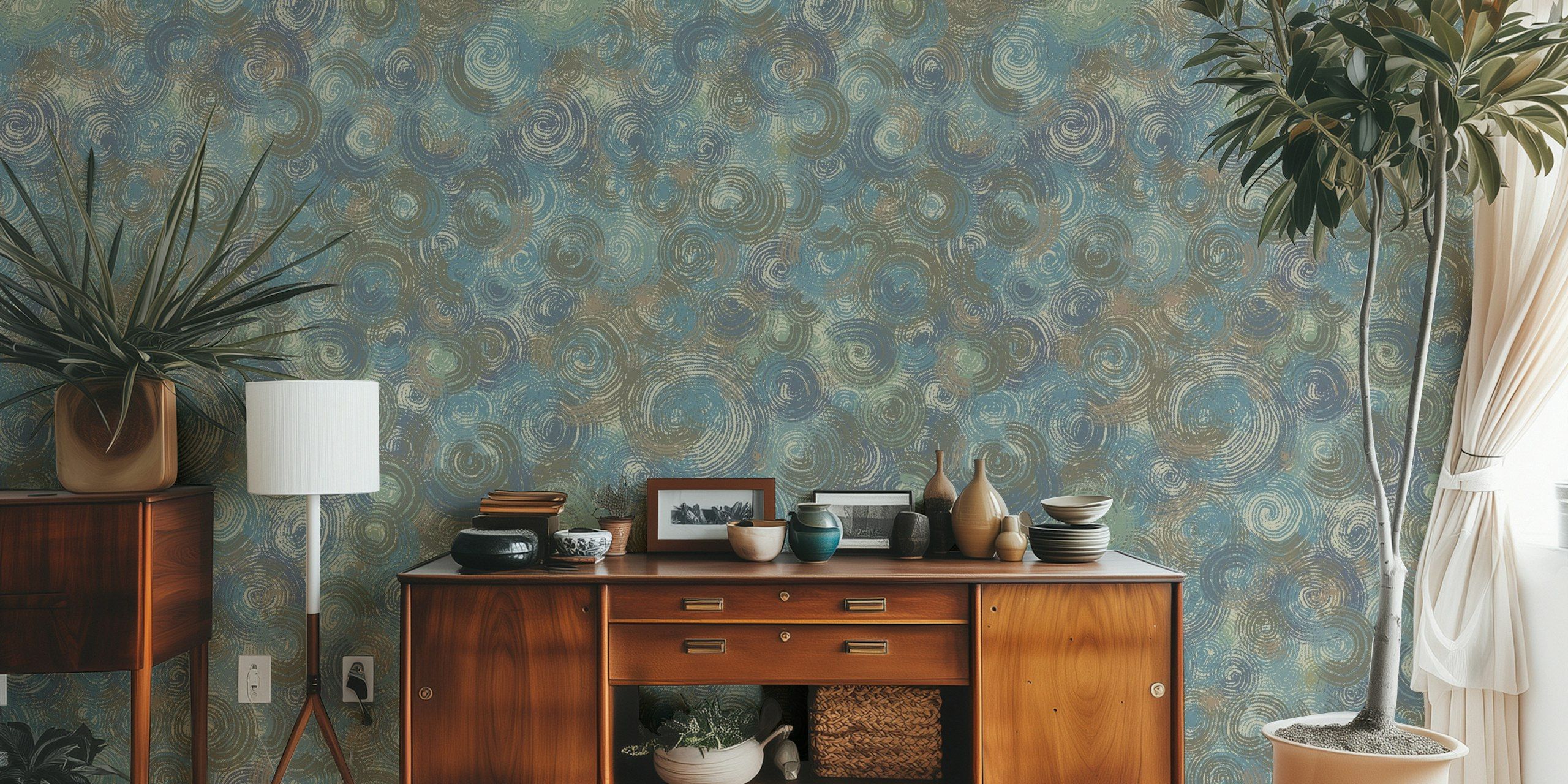
To decorate with prints in interior decoration, if you opt for more vibrant patterns, such as those in my series. Swirl DreamscapeMake sure that the main colors are present in other elements of the room.

A common mistake when combining prints is to use patterns of the same size, which can make the decor look cluttered. Alternating between large and small patterns creates a harmonious visual effect. For example, you can combine a wallpaper with bayadere stripes, such as Classic Grey Stripeswith smaller geometric or floral patterned cushions.

If you're afraid that too many prints might be overwhelming, balance the decor with natural materials such as wood, linen or rattan. A design like Rustic Swirl Harmonywith its watercolor effect, blends beautifully with a boho or Scandinavian style decoration.

If you're still hesitant about incorporating large-scale patterns, start with easy-to-change details: throw pillows, blankets, curtains or decorative prints. A neutral wall can be brought to life with patterned textiles, and if you want to vary the style in the future, all you need to do is replace them.
For a balanced combination, use this classic rule of interior design:
This method will help you to distribute the patterns harmoniously.
Decorating with prints doesn't have to be intimidating. It's all about finding the right balance of color, texture and scale. If you're looking to give your home a makeover, I invite you to explore my designs at HappyWallwhere you will find options for different styles and preferences.
Transform your space with patterns that reflect your personality!
You can leave your comments below and let me know if you found these tips useful.